What is Pulse?
Our given project brief to allow health-conscious individuals to log in to a responsive health and wellbeing app that offers them features to support their health. At the core, Pulse is a place for users to chart their health, find care and interact with their care providers.
What makes Pulse unique?
Honestly, the world doesn't need more health charting apps, but it does need one that has easy-to-use UI & UX. Pulse offers this while helping users locate both traditional and holistic care providers, message them easily through the app and save or share important health information directly within the platform.
Check out the live prototypeRole
UI/UX Designer
Researcher
Branding
Client
CareerFoundry UX Immersion Course
Scope
Mobile App Prototype
Timeline
5 Months
Background
Many people don't prioritize their health.
While talking with a nurse practitioner, I heard the caregiver's perspective on the struggles her patients have with engagement in their health. I became very curious when she said: "They expect me to give them a pill to fix everything."
This was the catalyst for my desire to better understand this problem. I began by asking which tools might be able increase patient engagement with healthcare, and if they already exist, why aren't they working?
Competitor Analysis
I spent time learning about the health app market.
My analysis began as a very broad exploration of digital health product offerings. It made me dizzy.
I realized this problem space was vast! There are over 350,000 health apps according to countless sources. I needed guidance from users to learn about the health app areas that weren't meeting needs for users.
Surveys
A quick series of health questions kicked off the research phase.
I asked 20 regular app users to complete surveys about how they currently engage with their health.
- Nearly 70% of respondants felt that tracking health data was important to them.
- 65% said that finding good healthcare was a barrier to better health.
The surveys brought clarity to the type of health app that might bring needed empowerment to users - a health charting app. I circled back and analyzed a few of these to get started. The few I know of have poor UI & UX, so I started to see an opportunity area.
Interviews
Insights were gained from asking app users targeted questions about healthcare and health charting apps.
Six people who already used at least one health or wellness app to track an aspect of their health were interviewed to get deeper into the health app problem space.
Interview Goals:
- Learn how people currently engage with health history and tracking health information
- Learn common practices for scheduling healthcare appointments and receiving test results ect.
- Find out which health and wellness apps and websites are being used already
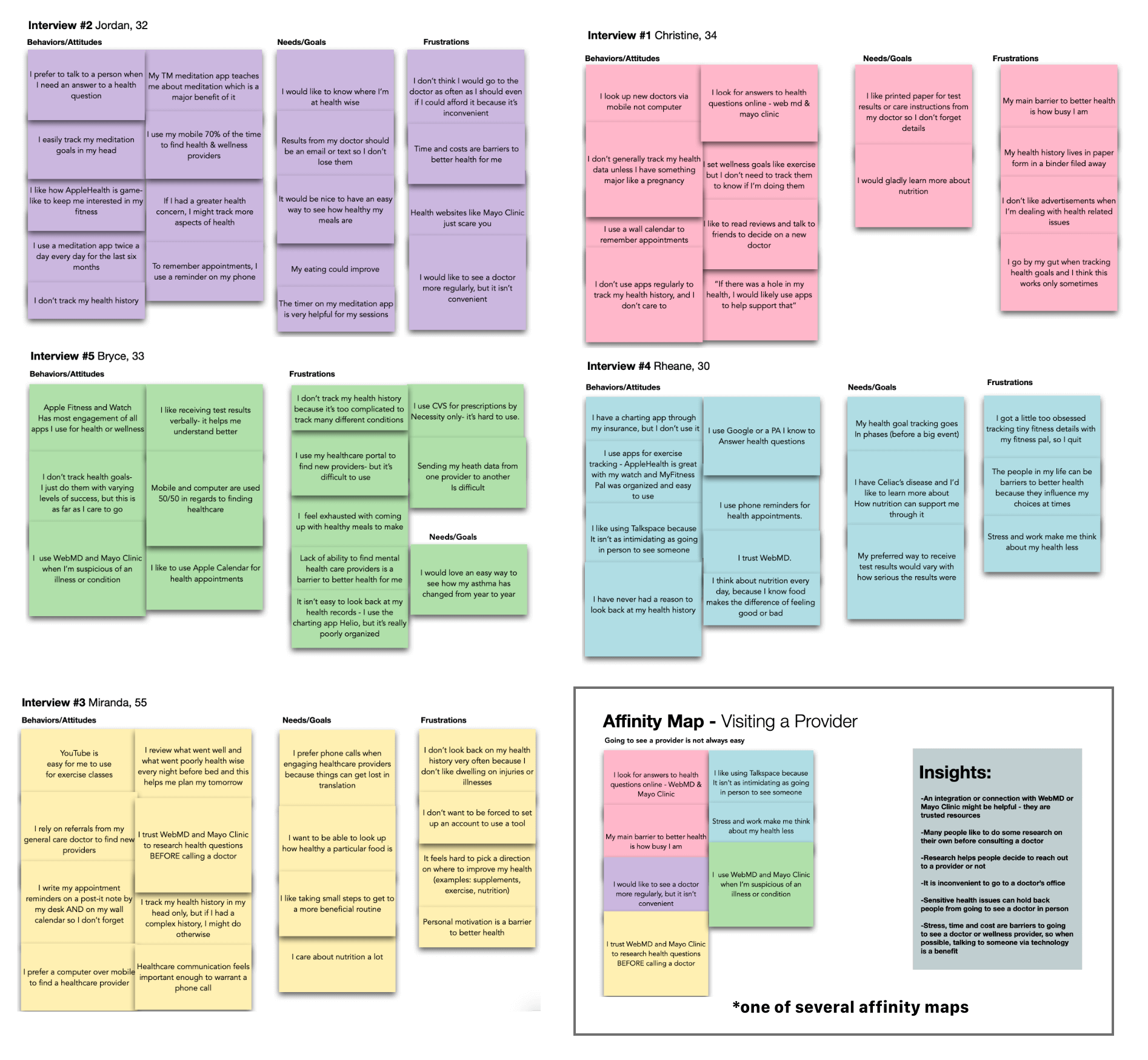
Insights
- Most people either use a paper filing system or rely on their doctor when they need historical health data
- The way that users prefer to receive test results is highly variable
- Even indivuals with complex health history do not want to put in the effort to track their health data
- Finding a new doctor is highly stressful
- Bad user experience makes people not want to go use charting apps suported by their care provider
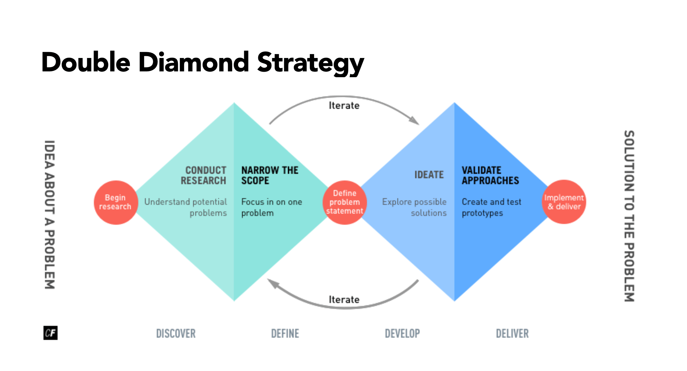
Feedback from interviews took me back to the analysis phase. Following the Double Diamond Stragety, I was able to narrow the scope and better understand the problem I was hoping to solve.
Wakeup call
A big realization changed my perspective on what users needed.
*Aha Moment* Maybe thinking an app can make users want to be more engaged with their care is the wrong way to go about it. Healthcare is perceived as a chore by many people, not something they enjoy. A more impactful focus will be to make this daunting process of receiving care easier.
Hypothesis
I'll circle back to the hypothesis often to keep on track.
By enabling users to find health and wellness care providers, schedule appointments and store their health data in one place we will see them more supported in their health journey.
Personas
Healthcare impacts everyone, so chosen personas represented a wide demographic.

User Stories
I began to realize which features were most important as I wrote user stories.
- As a person with a simple health question, I want to be able to get an answer from a healthcare provider without having to go into their office.
- As a person in need of healthcare, I want to schedule an appointment with a doctor based on my availability for convenience.
- As a person in need of healthcare, I want to see all of my options for a doctor near me, so that I can select the doctor that I am most comfortable with.
- As a person in need of healthcare, I want to search for providers by their specialization so that I can see the doctor that will help me with my issue.
Important Features:
- Finding & booking care
- Saving health data
- Contacting a provider between appointments
User Flows
The architecture of the app starts to come together.


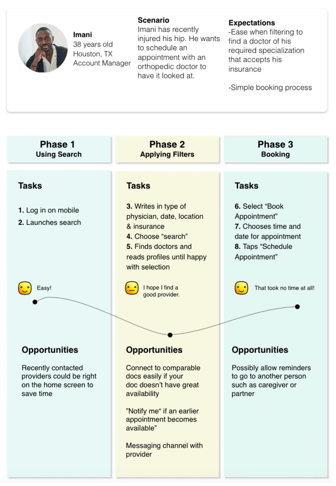
Journey Maps
I realized finding a doctor and booking them was the area that has the most potential, because people generally dislike doing this.
Sitemap
The app features are connected via a sitemap.
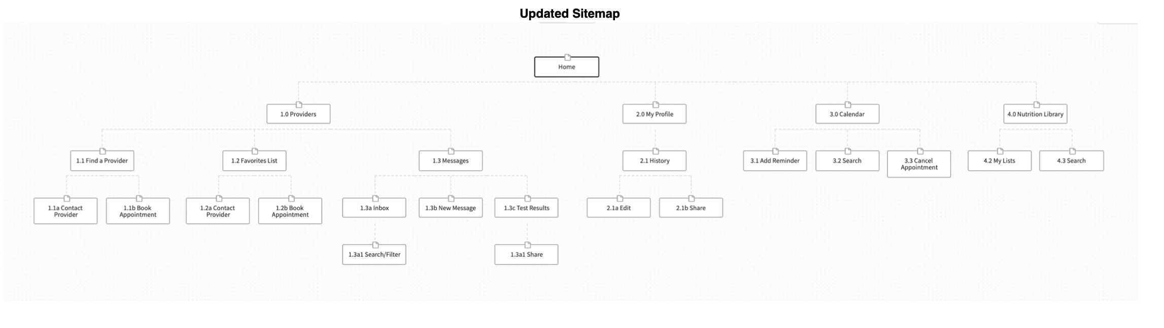
Notes:
1. The way to access messages was a struggle to decide. This seemed intuitive via a variety of places. I decided to wait to test this with users before making a final decision.
2.The favorites list location is also challenging. It ended up being on the home page for easiest access.
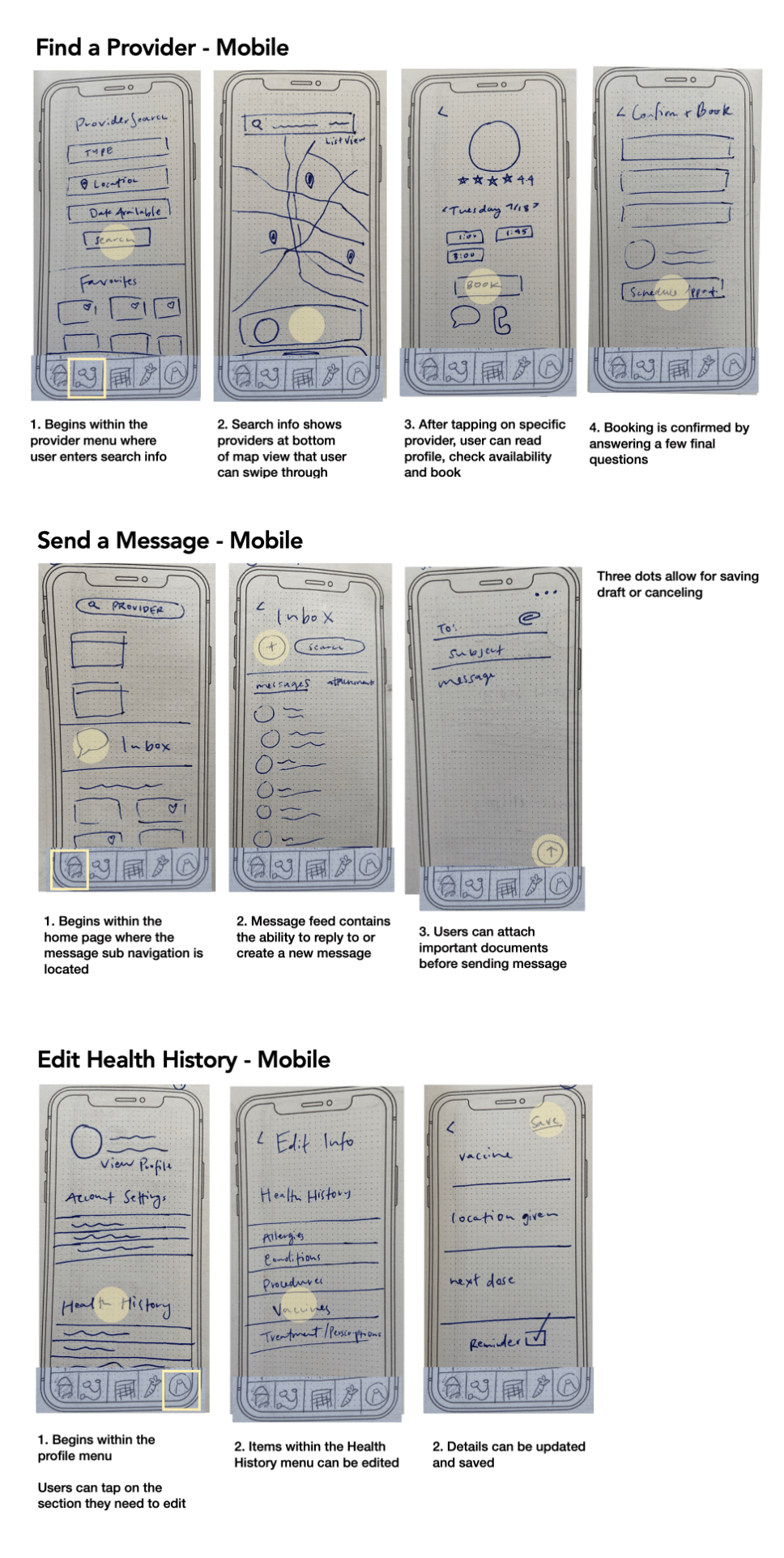
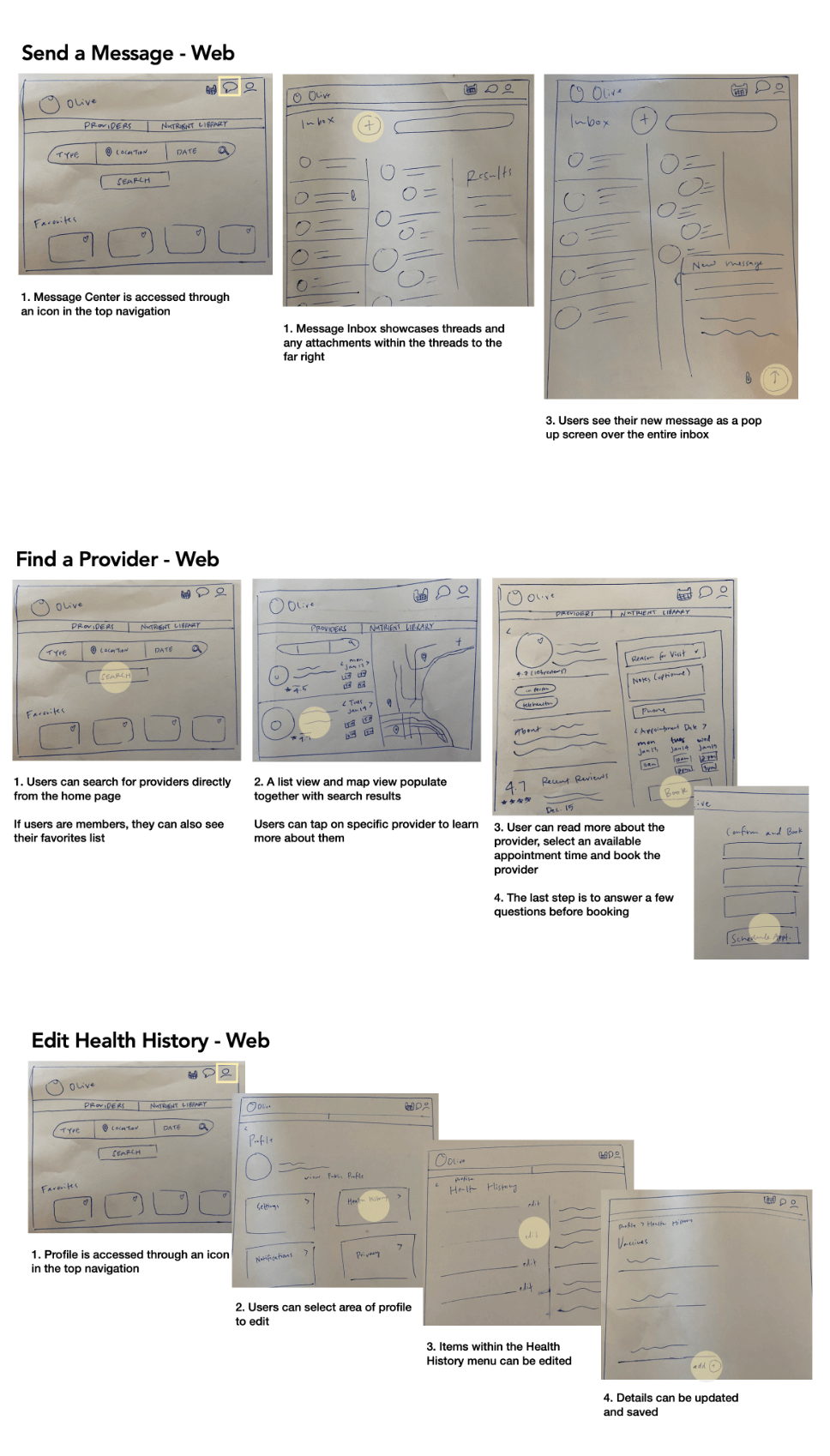
Low Fidelity Wireframes
A basic idea of screen elements takes shape with pen and paper.
I sketched out how mobile app wireframes would translate to a web app, because this felt important for particular demographics that will prefer to use their computer to find care.
Mid Fidelity Wireframes
Seeing the wireframes as a digital prototype reveals areas that need more clarity.
Updates:
- Added detailed patient information for booking page
- Created a map/list view for provider search
- Added "success" pages to confirm important actions
User Testing
Watching the prototype in use provided critical feedback.
Six willing participants were invited to complete a video-recorded usability test on the mid-fidelity version of the mobile prototype. While listening back, the the errors and negative feedback were categorized, quantified and rated by severity in order to prioritize necessary changes.


Painpoints
User problems resulted in drastic improvements!
Several changes were made based on user testing.

Branding & UI
A logo and look were developed to evoke trust and calm.

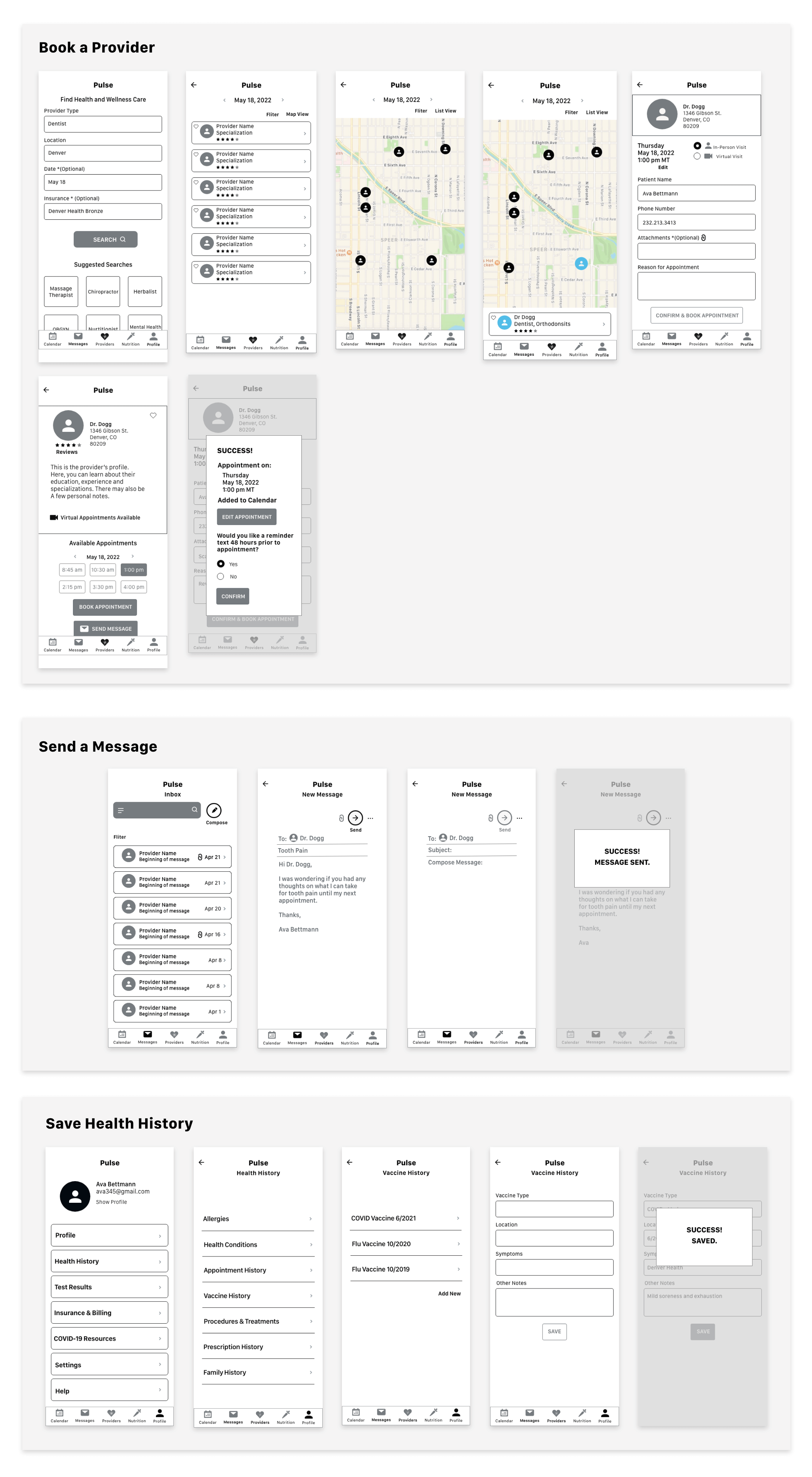
Final Product
A high fidelity prototype is ready.
The design received some additional accessibility changes before wrapping up the project.
Save Health Data

Find a Healthcare Provider

Message Doctor

Conclusion
The Pulse app supports users on their health journey.
It solves the problem of keeping health data in the hands of the true owners, the patients. It also
facilitates finding, scheduling and talking to healthcare providers with ease. When all aspects of
a healthcare appointment are in one place, patients can focus on their health instead of administrative hassles.
They may just find they dislike the process of finding care a little less.
Discoveries
1. User feedback can change everything. They generally felt that healthcare is a chore, and what they need is a way to make it simpler, not necessarily a way to be more involved. Learning this shaped the entire
direction for the app.
2. An app is not always the holistic answer. I realized that my solution might be best accompanied by smart kiosks. They could operate in secure locations with private booths. The booths might be set up similar to a post
office, and located by neighborhood. Here, patients could schedule a time to utilize one and either submit vitals to doctors or chat with a nurse live. This could revolutionize follow-up visits and quick care needs on both the patient and
caregiver end.
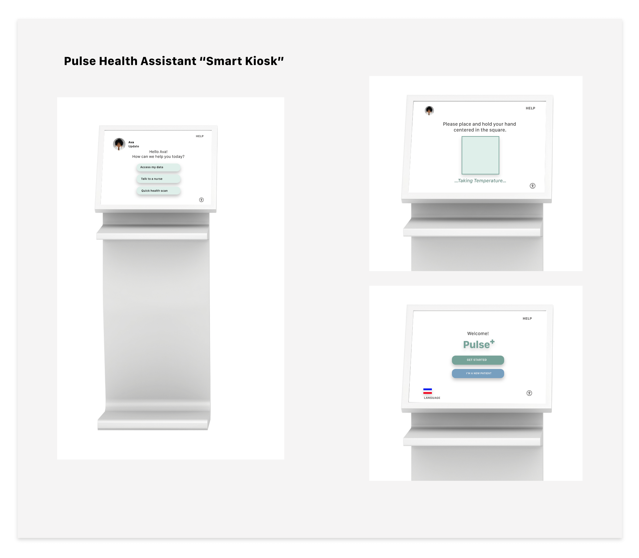
Future Improvements
- Build out kiosk features
- Emphasis on health data security & privacy
- Concept the app for the provider’s side *This would likely have been built for release simultaneously, as it would be monetized via the provider paying to belong to the platform*
- Deeper level of accessibility including voice control
Explore More Projects